Katsushika Hokusai Ukiyo-e: 670+ High-Res Works by Series
Hokusai Ukiyo-e: The Great Wave and 670+ High-Res Works
 Edit
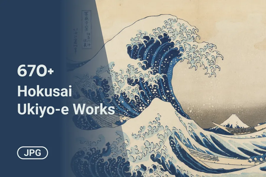
676 high-res Hokusai images: The Great Wave, 44 more Views of Mount Fuji, print series, Hokusai Manga, and 185 paintings. Tagged for Eagle. JPG, public domain.

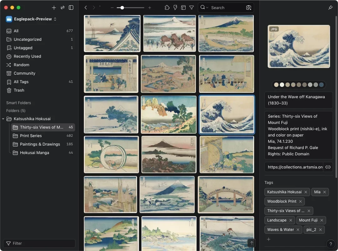
This eaglepack brings together 676 high-res images of work by Katsushika Hokusai (1760-1849), the ukiyo-e artist behind The Great Wave off Kanagawa. Every image is in the public domain and free for commercial use. They come from the open-access collections of the Art Institute of Chicago (AIC), the Minneapolis Institute of Art (Mia), the Smithsonian's National Museum of Asian Art (Freer collection), and the Cleveland Museum of Art. The pack is organized into four folders: Thirty-six Views of Mount Fuji, Print Series, Paintings & Drawings, and Hokusai Manga. Each image is tagged in English by series, subject, and format. Download the pack, import it straight into Eagle, and click any tag to filter.
Most people know Hokusai for one print. Alongside The Great Wave and the rest of the Mount Fuji series, this pack includes his waterfall, bridge, and bird-and-flower prints, pages from Hokusai Manga, and 185 paintings and drawings made by his own hand. Of those, 159 come from the Freer collection, which never lends its works.
What's in the Pack
The pack contains 676 JPG images in four folders:
- Thirty-six Views of Mount Fuji: 45 images
- Print Series: 402 images from the Tokaido, Hyakunin Isshu, waterfall, bridge, and other series
- Paintings & Drawings: 185 hanging scrolls, album leaves, screens, and sketches
- Hokusai Manga: 44 pages and covers
The full Thirty-six Views of Mount Fuji has 46 prints. This pack has 45, and the missing one is Climbing on Fuji. The 159 Freer works in Paintings & Drawings form the largest collection of Hokusai paintings in the world. Its founder's will doesn't allow loans, so normally you'd have to go to Washington, D.C., to see them.
Every image carries three kinds of English tags:
- Series, such as Fifty-three Stations of the Tokaido and A Tour of Waterfalls in Various Provinces
- Subject, 11 in all, including Landscape, Waves & Water, Flowers & Birds, and Ghost & Supernatural
- Format, such as Woodblock Print, Hanging Scroll, Album Leaf, and Folding Screen
The subject tags work as filters. Click Waves & Water for 62 images of waves and water, Flowers & Birds for 77, or Ghost & Supernatural for 13 ghosts and yōkai. The notes field keeps the source collection, medium, and accession number, in case you want to look up the original.
Can You Use Hokusai's Work Commercially?
Yes. Hokusai died in 1849, and his work is in the public domain worldwide, so you can use it commercially without permission or attribution. The digital files are unrestricted too: AIC, the Cleveland Museum of Art, and the Smithsonian release their images under CC0, and Mia marks its images as Public Domain.
What Can You Learn from Hokusai's Work?
Hokusai is worth studying for the way he used geometric shapes, a few colors, and a repeated subject to build images you remember at a glance. Each point below comes with a screenshot from Eagle, so you can follow along once you've imported the pack.
1. Building a Composition from Shapes: Thirty-six Views of Mount Fuji
In his 1812 drawing manual Quick Lessons in Simplified Drawing, Hokusai explained that he taught drawing with a compass and a carpenter's square, breaking figures and objects into circles, squares, triangles, and straight lines. You can see it most clearly in the Mount Fuji series:
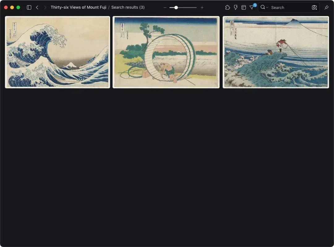
- Under the Wave off Kanagawa: the curve of the wave carries your eye to Fuji
- Fuji View Plain in Owari Province: a round barrel frames a distant Fuji
- Kajikazawa in Kai Province: fisherman, rock, and lines form a triangle
When you lay out a banner, a poster, or a website hero, try deciding how the eye moves with a few basic shapes first, then place the elements. The circle grids designers use for logos come from the same thinking.
2. Three Colors Can Carry an Image: Red Fuji and Limited Palettes
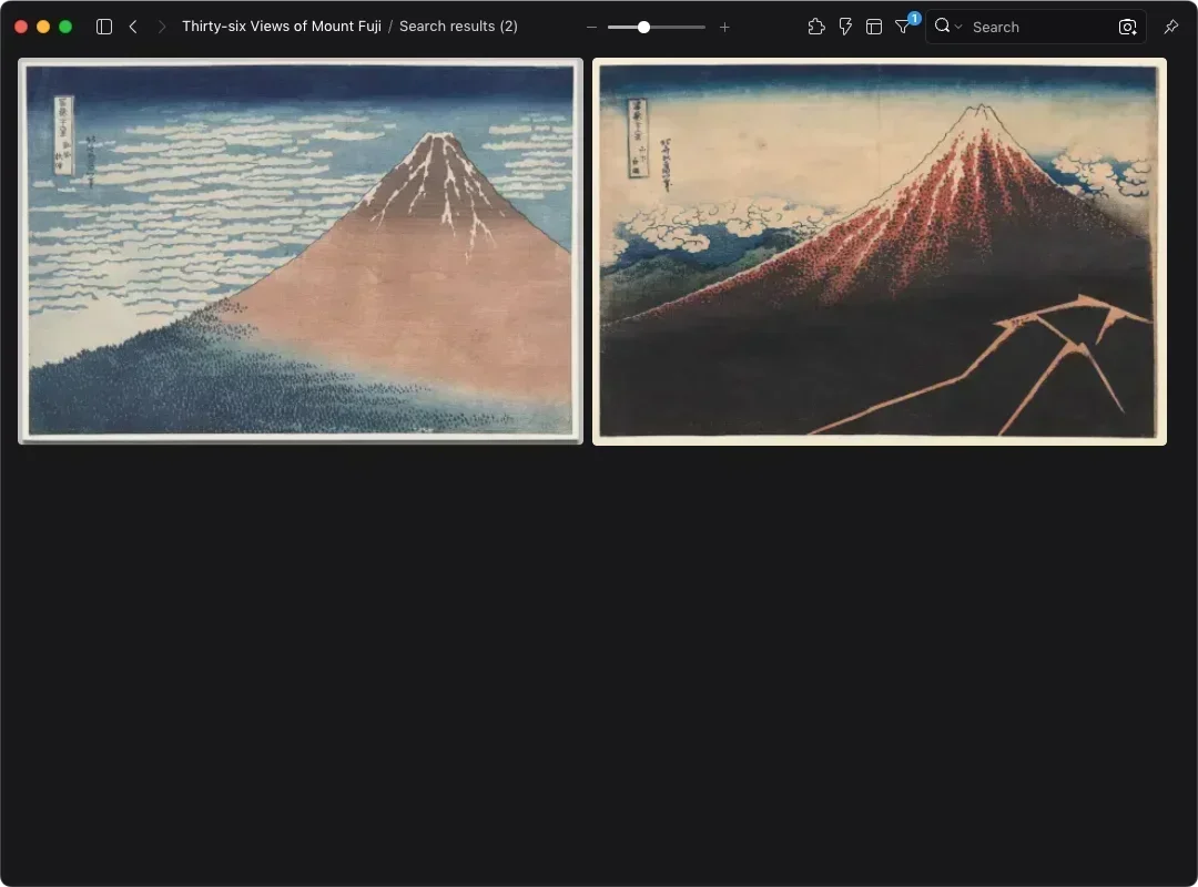
South Wind, Clear Sky, better known as Red Fuji, has a red-brown mountain, a blue sky, white clouds, and a bit of dark green at the base. That's about four flat areas of color. Rain Below the Mountain has nearly the same composition, but it darkens the base and adds lightning. Same mountain, new palette, and a clear day becomes a storm.
Brand designers have to decide how many primary and secondary colors a system needs, and limited-color printing has to finish an image in just a few plates. Put these two side by side and you can see that three or four colors are enough when the proportions are right.
The color of the lines matters too. According to the Chiba City Museum of Art, the first 36 prints in the series have outlines printed in blue, while the 10 added later, known as the ura-Fuji, went back to black ink. The pack includes 9 of those 10, so you can compare how line color changes the feel of a whole image.
3. One Subject, 45 Angles: Mount Fuji as a Series
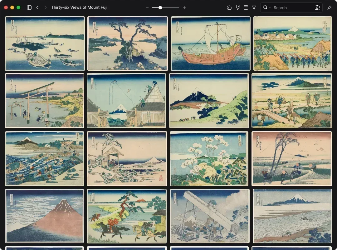
Mount Fuji appears in every print of the series. Sometimes it's the main subject, as in Red Fuji. Sometimes it's a small triangle in the trough of a wave, or a glimpse through a barrel, under a bridge, or past a roof. The subject stays the same while its size, position, and framing keep changing, and the series never repeats itself.
If you design a brand campaign or a run of social posts, you know the problem: one element has to show up again and again without every piece looking the same. Lay out all 45 prints in Eagle's grid view and you can see how much of each frame Fuji takes up, and where it sits.
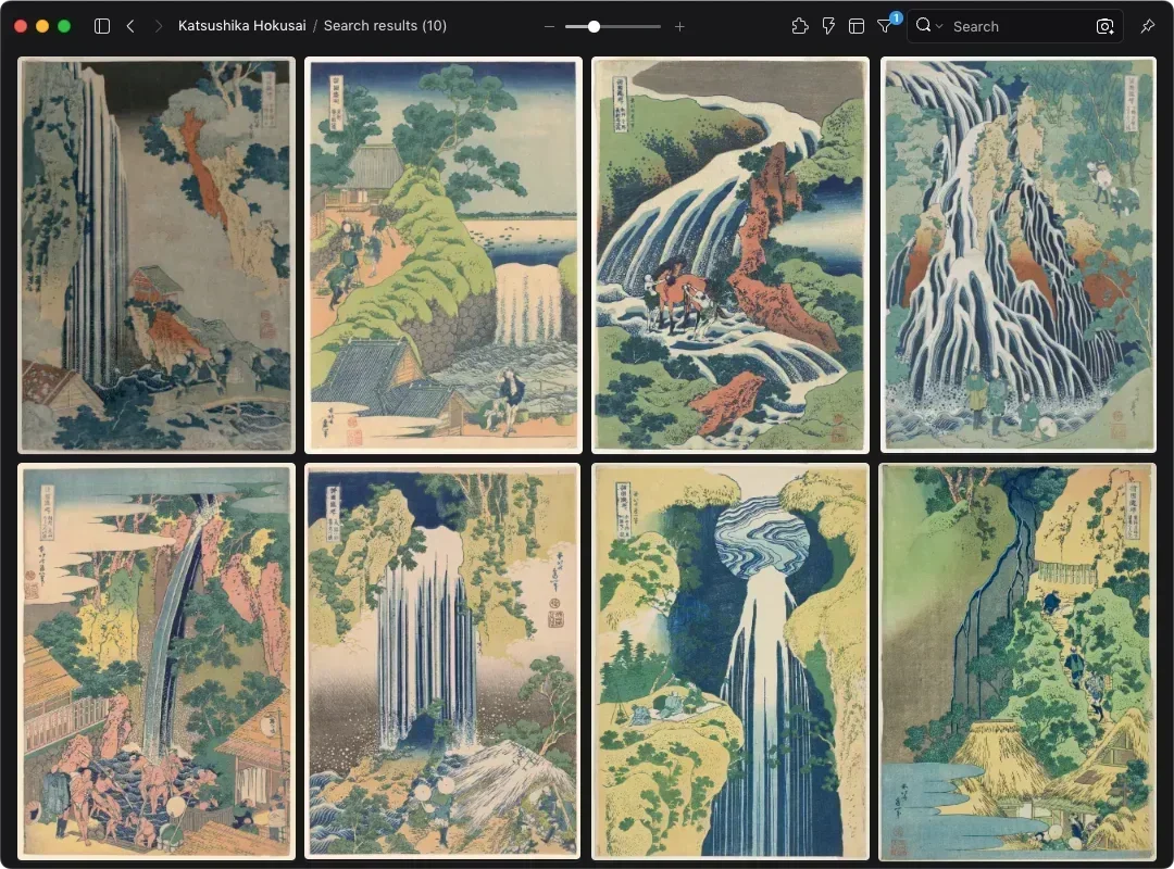
4. Turning Nature into Pattern: A Tour of Waterfalls
Amida Falls in the Far Reaches of the Kisokaido turns the source of the falls into a near-perfect circle. Kirifuri Waterfall at Mount Kurokami in Shimotsuke Province breaks the water into bundles of parallel lines that hang like rope. Hokusai doesn't draw spray realistically. He organizes the movement of water into repeating shapes.
Designing icons, patterns, or supporting brand graphics often means reducing something complex from nature to a few regular lines. Click the A Tour of Waterfalls in Various Provinces tag in Eagle to pull up the whole set, then look at which features he keeps and which details he drops.
5. A Page as an Icon Set: Hokusai Manga
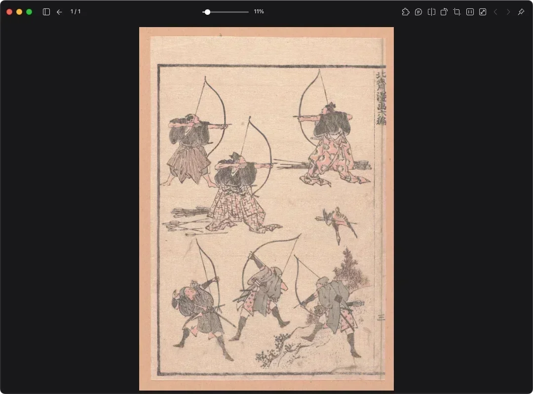
Pages from Hokusai Manga, such as Archers and Firelock, fill the sheet with variations on one kind of figure or object. Each is drawn with similar line weight and the same proportions, a lot like a consistent set of icons or illustrations. (Despite the name, the book has no panels and no story. It's a collection of drawings with no direct link to modern manga.)
The hardest part of an icon set or illustration system is making dozens of different things look like they belong together. Hokusai Manga shows how consistent line work and a shared level of simplification let people, animals, and tools sit on one page without clashing. If you do character design, these pages also work as references for poses and movement.
6. Finding Prussian Blue with Eagle's Color Filter
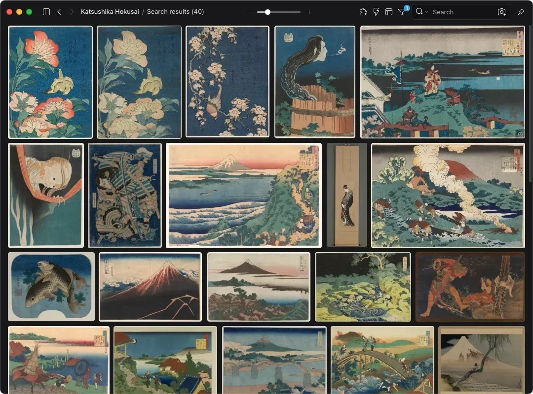
Most of the blue in the Mount Fuji series is Prussian blue, a synthetic pigment first made in Berlin in the early 1700s. It was brighter and more lightfast than the plant-based blues Japanese printers had used. Hokusai wasn't the first ukiyo-e artist to use it, since Keisai Eisen had by 1829. But Thirty-six Views of Mount Fuji was the first major landscape series to use it heavily, and blue became the signature color of ukiyo-e landscapes after that.
To use that blue as a palette reference, pick a deep blue in Eagle's color filter to pull blue-toned works from all 676 images, then sample colors from them to build your own palette. You can stack a subject tag on top, for example to see only the blues in Waves & Water.
About Katsushika Hokusai
Ukiyo-e prints of the Edo period were made by a team: an artist drew the design, a carver cut the blocks, a printer inked them, and a publisher sold the result. Hokusai was the artist. Born in Edo in 1760, he trained in a kabuki-portrait studio and also studied Western perspective, then published the first volume of Hokusai Manga in 1814 as a sketchbook for students to copy. He was already in his seventies when he released the Mount Fuji and waterfall series in the early 1830s.
From the mid-1830s he focused on painting, with his daughter Katsushika Ōi as his main assistant. He died in 1849 at 90 by the traditional Japanese count.
Hokusai's Influence on Design
After his work reached Europe in the late 19th century, it turned up on sheet music, in print series, and on official documents. The cover of the first edition of Claude Debussy's La Mer (1905) used a cropped version of The Great Wave. In 1902, the French artist Henri Rivière published Thirty-six Views of the Eiffel Tower, borrowing the title and structure of Hokusai's series with the tower in place of Fuji. Today, Japanese passports issued since 2020 use the Mount Fuji series on their visa pages to help prevent forgery, and the 1,000 yen note issued in 2024 has The Great Wave on the back.
You may also like