【Web Design Inspiration Picks】800+ Examples of "Pricing Page" Design References (SaaS / Business Software)
【Web Inspiration Picks】800+ Examples of "Pricing" Page Design
Complete collection of 800+ business examples of pricing pages, enhancing UI/UX design skills comprehensively from details to copywriting.


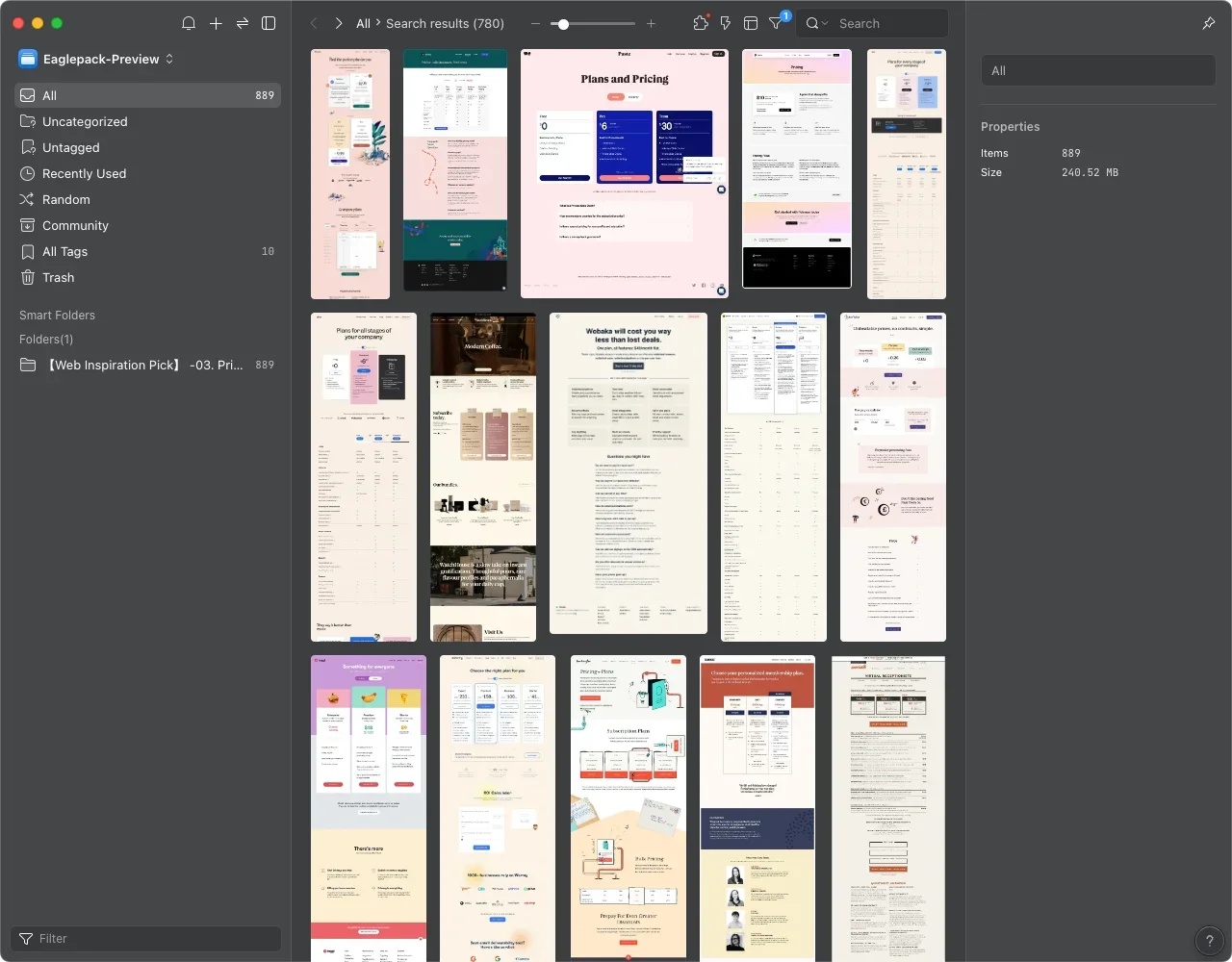
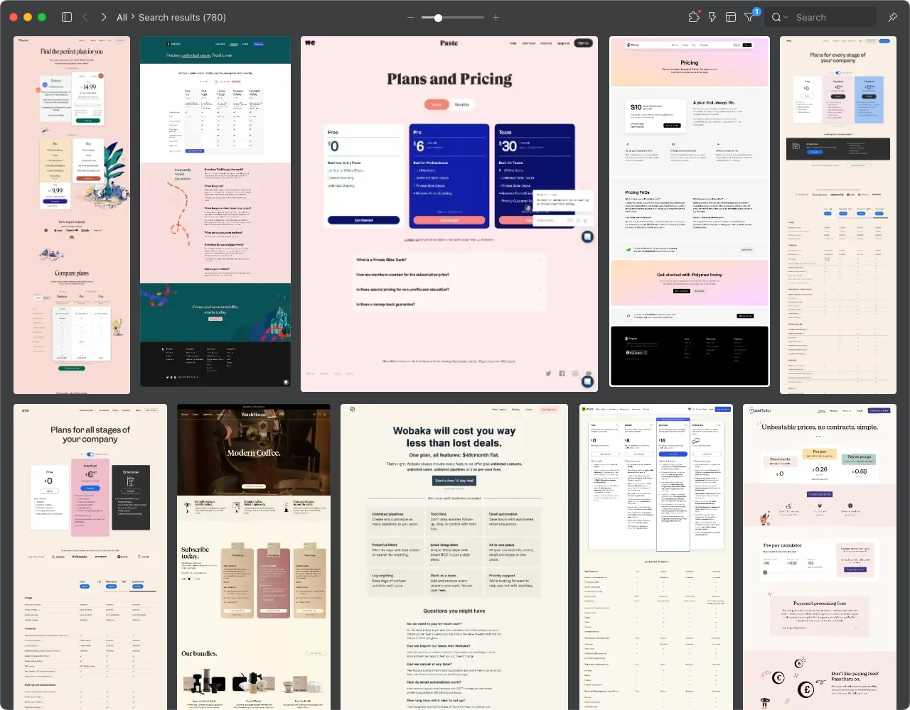
Curating Over Ten Thousand Web Designs to Extract the Most Essential Inspirational Examples ✨
In my line of work, the need for convenient client discussions, coupled with my personal interest in web design, led me to gradually collect website pages from several major inspiration-sharing platforms such as Lapa Ninja, Land-book, and Landingfolio, spanning various industries. With some spare time before the holidays, I decided to meticulously organize and categorize these design assets and inspirations to share them with others, aiming to help streamline the process of finding inspiration and organizing resources.
【Web Inspiration Picks】Currently, after initial planning and organization, I anticipate a series of 10 posts covering different page themes. Two of the previously submitted and successfully approved posts are about "About" pages and "Product" pages. For those interested in collecting design examples and inspirations for these two types of pages, you can click on the article titles below to download them.👇🏻
1.【Web Inspiration Picks】700+ Examples of "About" Pages
2.【Web Inspiration Picks】600+ Examples of"Product" Pages
Collect Design Case Inspirations and Get Real-world Business Copy References
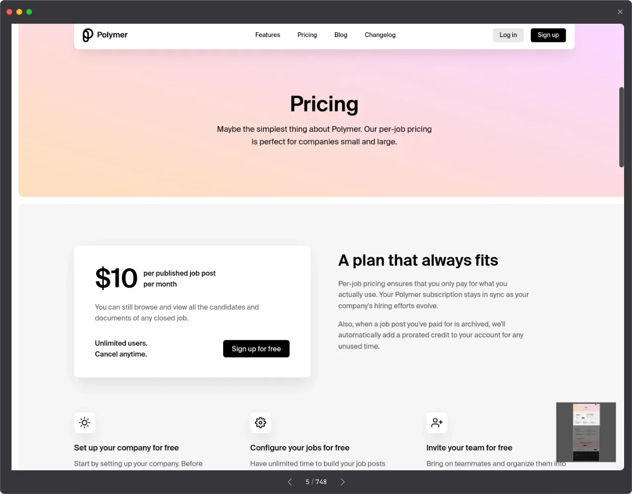
The third post in 【Web Inspiration Picks】focuses on Pricing Pages. This category was specifically curated as I had a previous client engaged in software development, seeking to integrate payment services for their product users, requiring a convenient payment page. At that time, I gathered numerous pages related to software and SaaS for reference, including some subscription-based services. Apart from aiding in design inspiration, these real-life examples also served as additional copy references for the client's page content. If you're contemplating pricing and content differentials for your product/service tiers, I believe this Eaglepack will be of great assistance!
Want to Design Appealing Pricing Pages? Four Key Tips for You :pencil:
From these 800+ examples, I've summarized several key design points to share with you here:
Clear Pricing Structure and Concise Comparison Table:
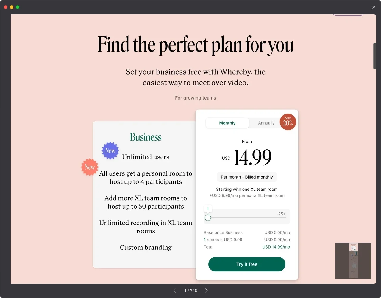
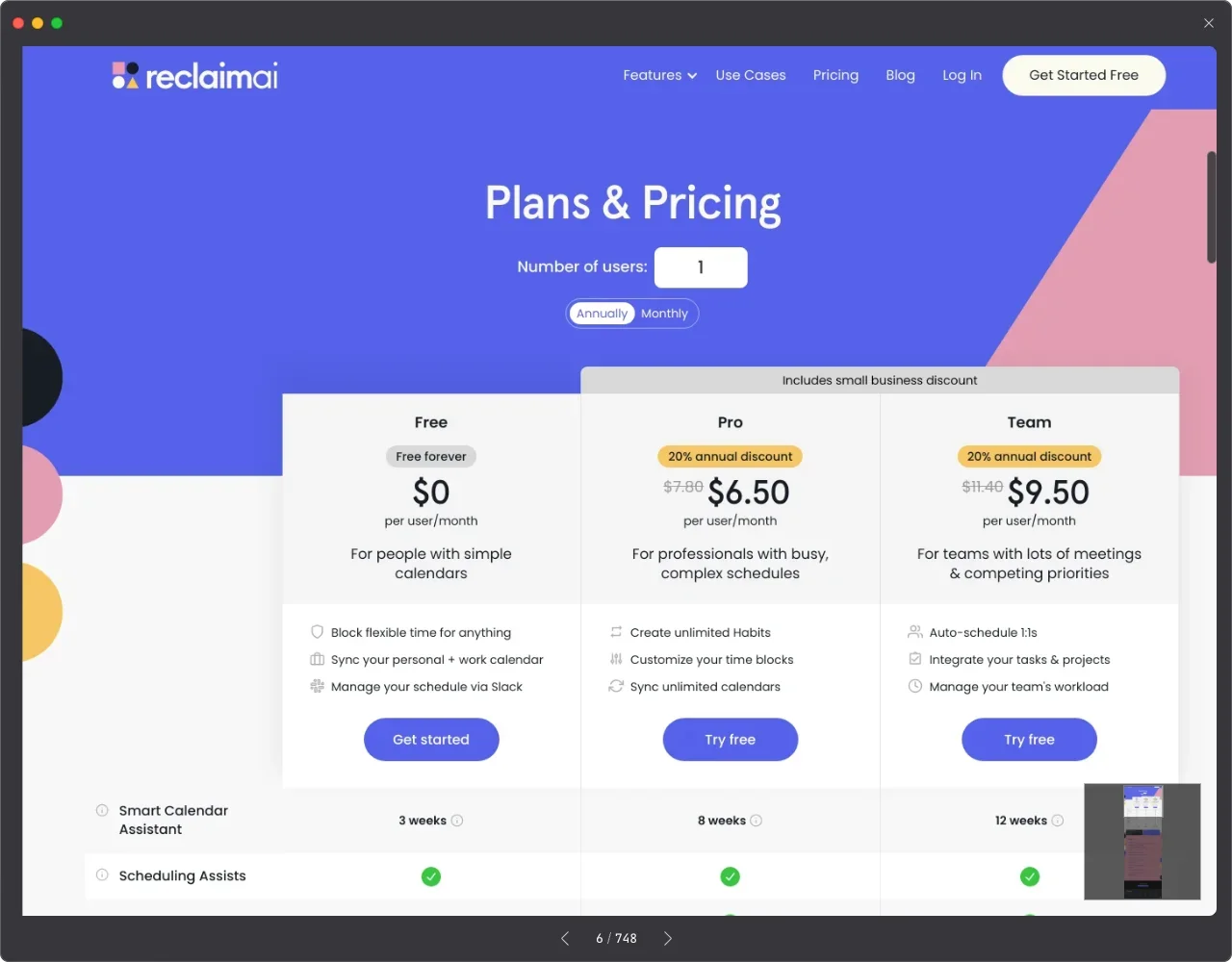
Since it's a pricing page, providing consumers with clear prices is paramount. If your product/service offers tiers, be sure to provide a clear service tier comparison table, enabling consumers to make choices based on their needs easily.Emphasize Core Value:
Usually paired with a comparison table, emphasize the main functions of the product/service based on different tiers and service content.Call-to-Action (CTA):
Encouraging potential consumers to take action, typically with CTA buttons like "Free Trial," "Try it free," "Get Started," etc.Design Consistency and Mobile Optimization:
Maintaining overall design consistency and style is essential for professionalism and trust. Additionally, given the prevalence of mobile devices, optimizing for mobile experience, especially in visual optimization and adjustment for comparison tables, requires significant effort.
