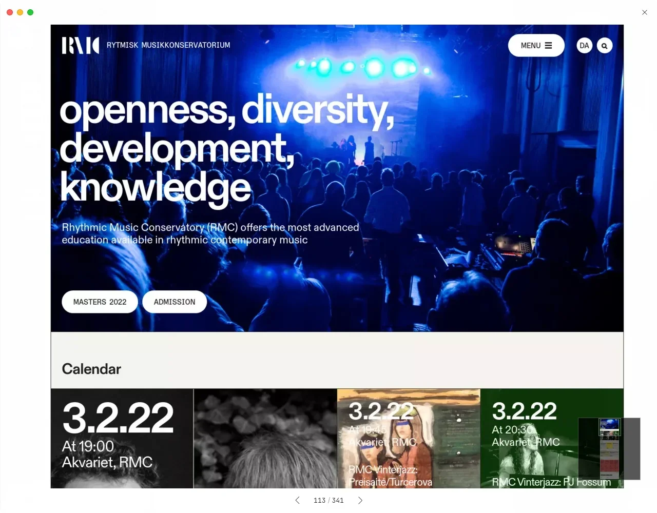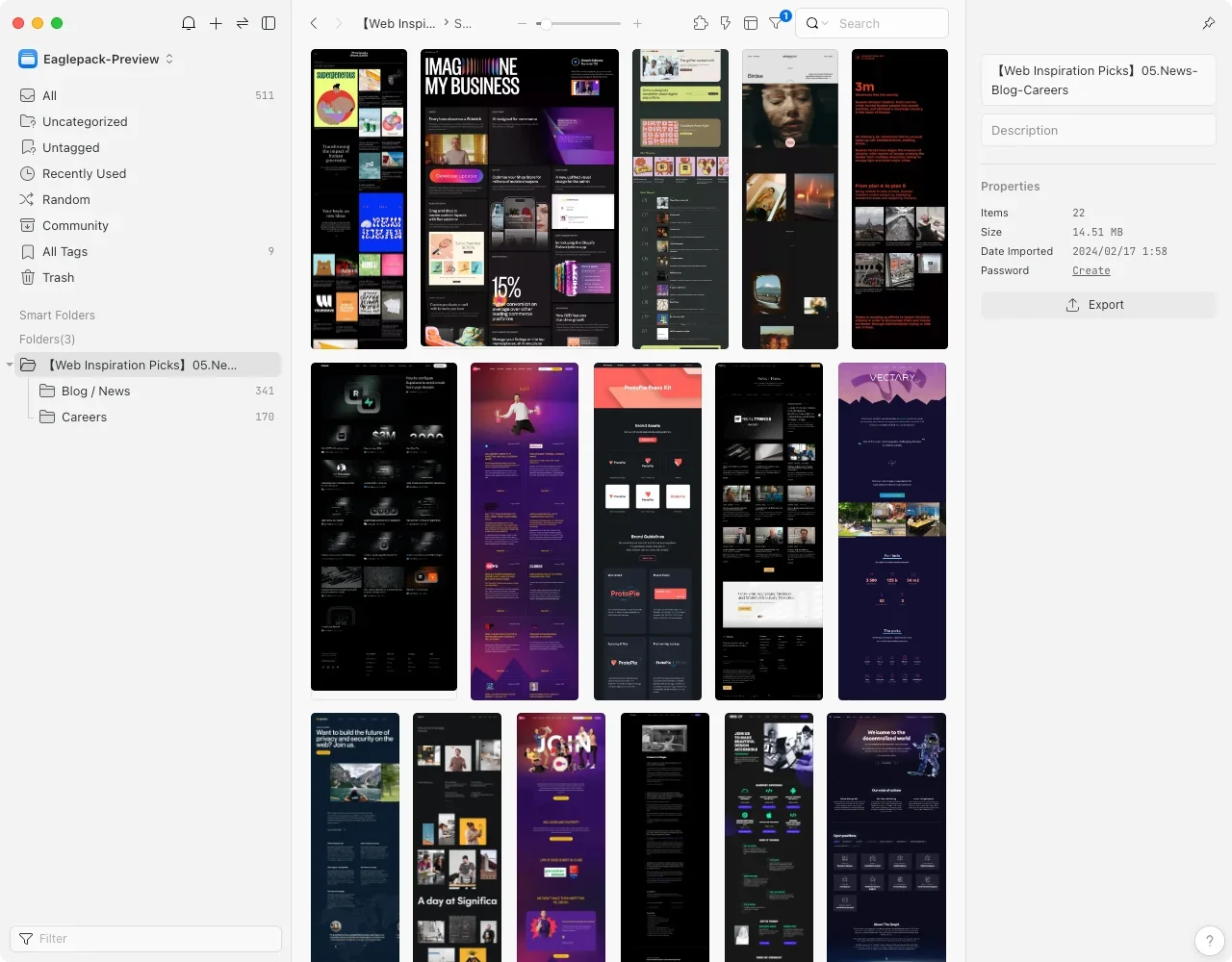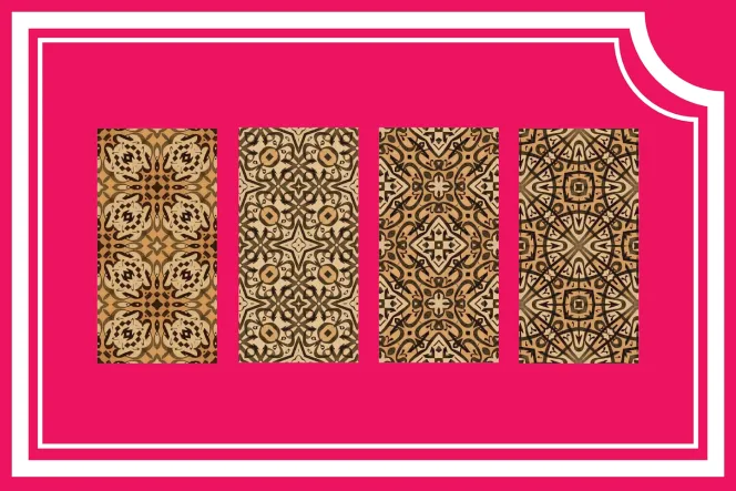
Curating Over 500 News Blog and Career Page Designs for Inspiration (Text Media/Job Listings)
【Web Design Inspiration Picks】500+ Example of "News, Blog & Careers" Page Design
Featuring over 500 curated web design inspirations to optimize website experience. In-depth analysis of news/blog layouts and career page designs.


Curating Over Ten Thousand Web Designs to Extract the Most Essential Inspirational Examples ✨
Due to the need to facilitate discussions with clients at work and my personal interest in web design, I recently collected various industry website pages from major inspiration-sharing sites (such as Lapa Ninja, Land-book, Landingfolio, etc.). During my recent vacation, I had more free time, so I decided to organize and curate these design materials and inspiration libraries, distilling the essence and categorizing them. I then submitted my findings to share with others, helping everyone save time in searching for and organizing inspiration.
After initial planning and organization, the [Web Inspiration Selection] series is expected to include ten different page-themed articles. Four of these articles have already been submitted and successfully approved. Those interested in collecting these can click on the article titles below to download them! 👇🏻
1.【Web Inspiration Picks】700+ Examples of "About" Page Designs
2.【Web Inspiration Picks】600+ Examples of "Product" Page Designs
3.【Web Inspiration Picks】800+ Examples of "Pricing" Page Design
4.【Web Inspiration Picks】400+ Examples of "Customers & Showcase" Page Design
✌🏻 Essential Typography Principles for Book Interiors and H5 Long Images
Appropriate Paragraphs and Segmentation:
Divide the planned text content into appropriate paragraphs and segments to make reading smoother and easier to understand.
Readable Fonts and Typeface: Choose highly readable fonts and typefaces to ensure clarity and maintain readability across different screen sizes and resolutions.
🔍 Six Key Layout Elements for News/Blog Websites to Enhance Professionalism and User Experience
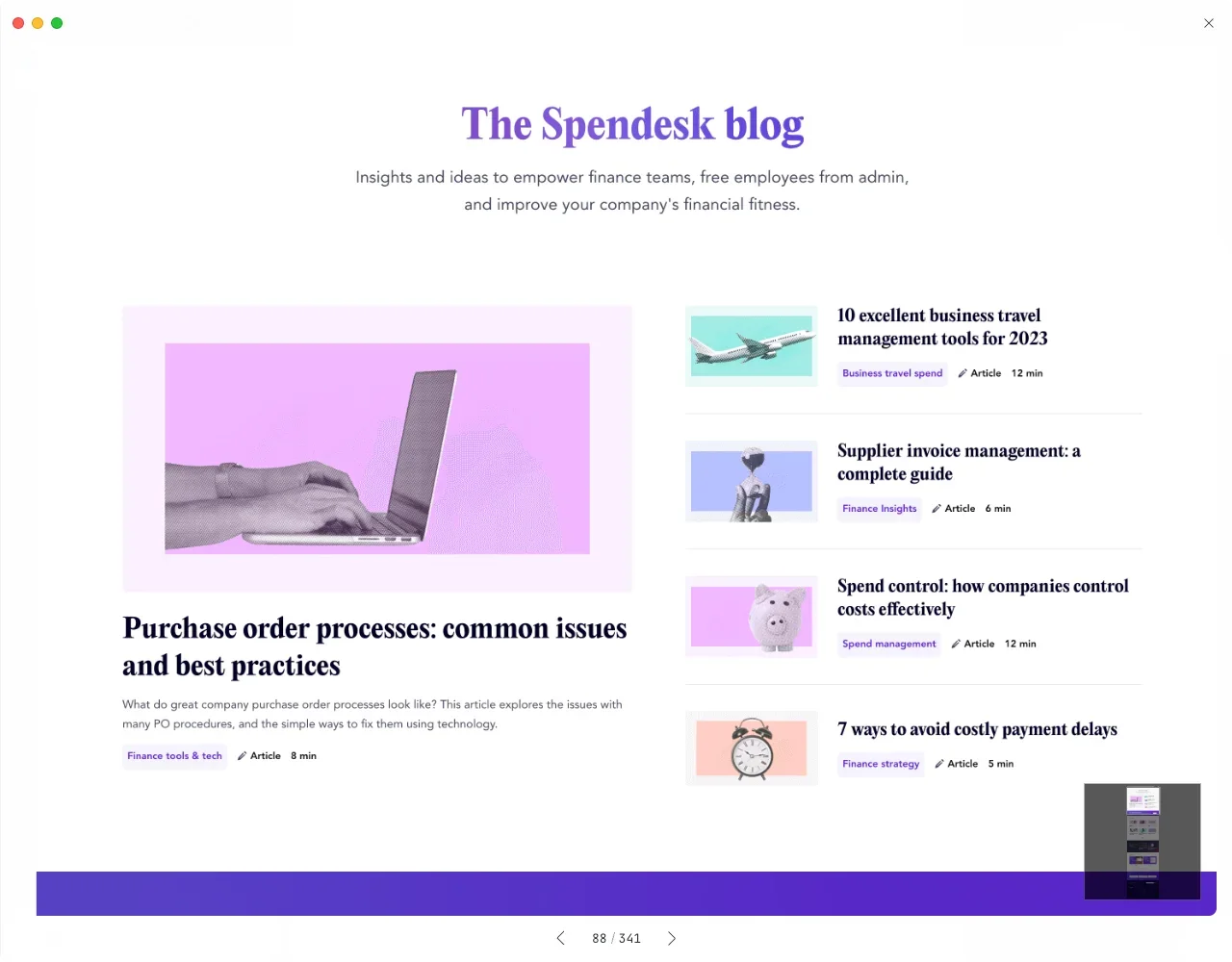
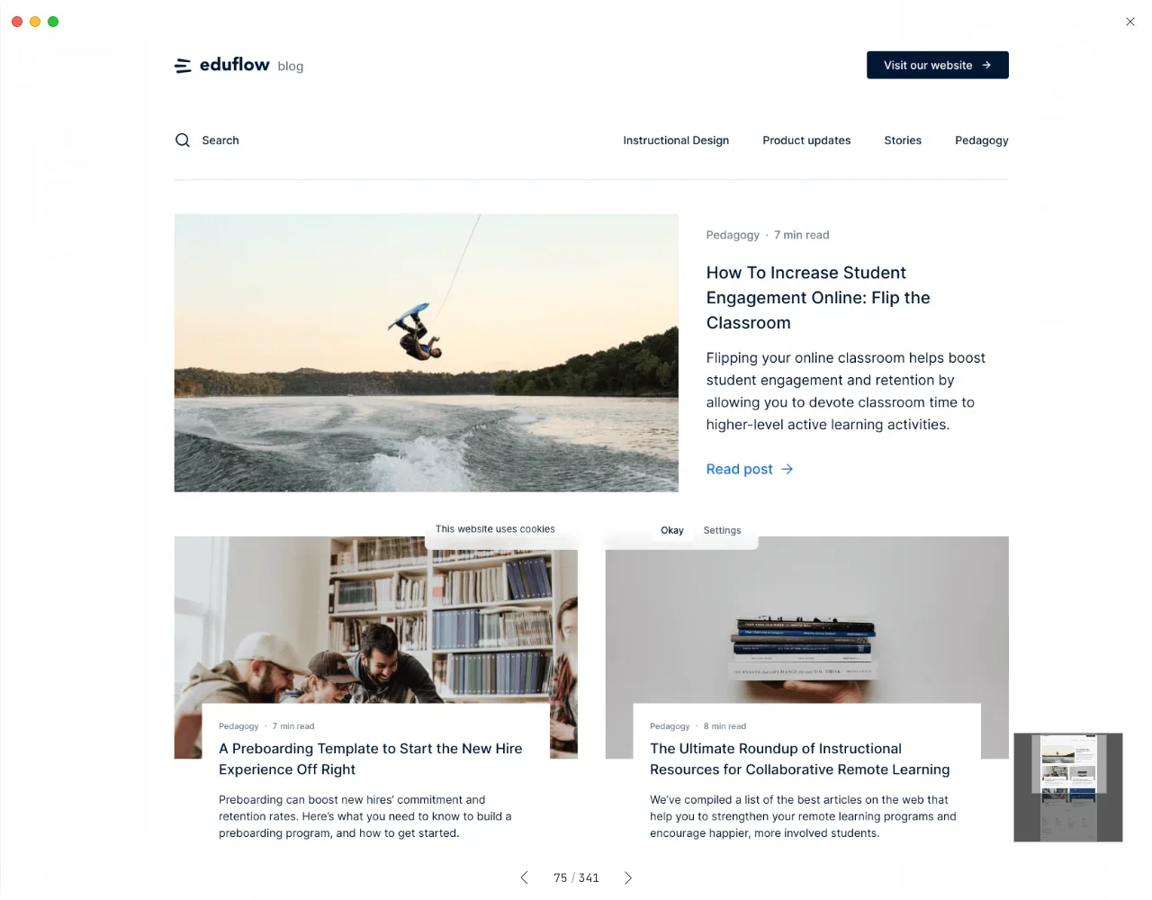
While short videos and illustrated texts currently dominate media traffic, professional news websites still prefer layouts that can accommodate more textual content, planning a comfortable and deep reading experience. Here are six key points for your reference:
Categories and Tags:
Pages for news, blogs, and brand news usually have clear categories and tags, allowing visitors to easily find content that interests them.Headlines or Featured:
These pages need to highlight important news or articles, often using larger headlines or special styles to attract visitors' attention.Multimedia Content:
News, blogs, and brand news pages often include rich multimedia content, such as images, videos, or audio, to enhance content appeal and richness.Real-time Updates and Timeliness:
These pages usually need to stay up-to-date, presenting the latest news, articles, or brand news. Therefore, the layout design must consider the timeliness of the content and provide date and time for visitors to check.Summaries and Previews:
To help visitors quickly understand the content, news, blogs, and brand news pages often provide summaries or previews, allowing visitors to get an overview before clicking to read more.Quotes, Links, and Sharing:
These pages may include features for quoting, linking to other related content, and social media sharing, which can help drive website traffic.
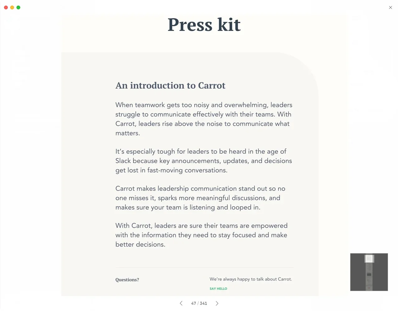
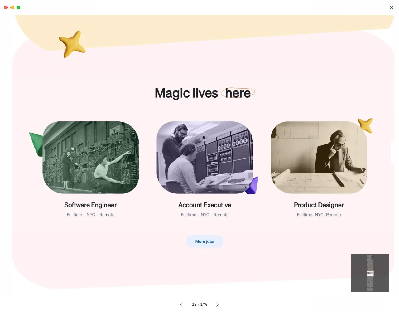
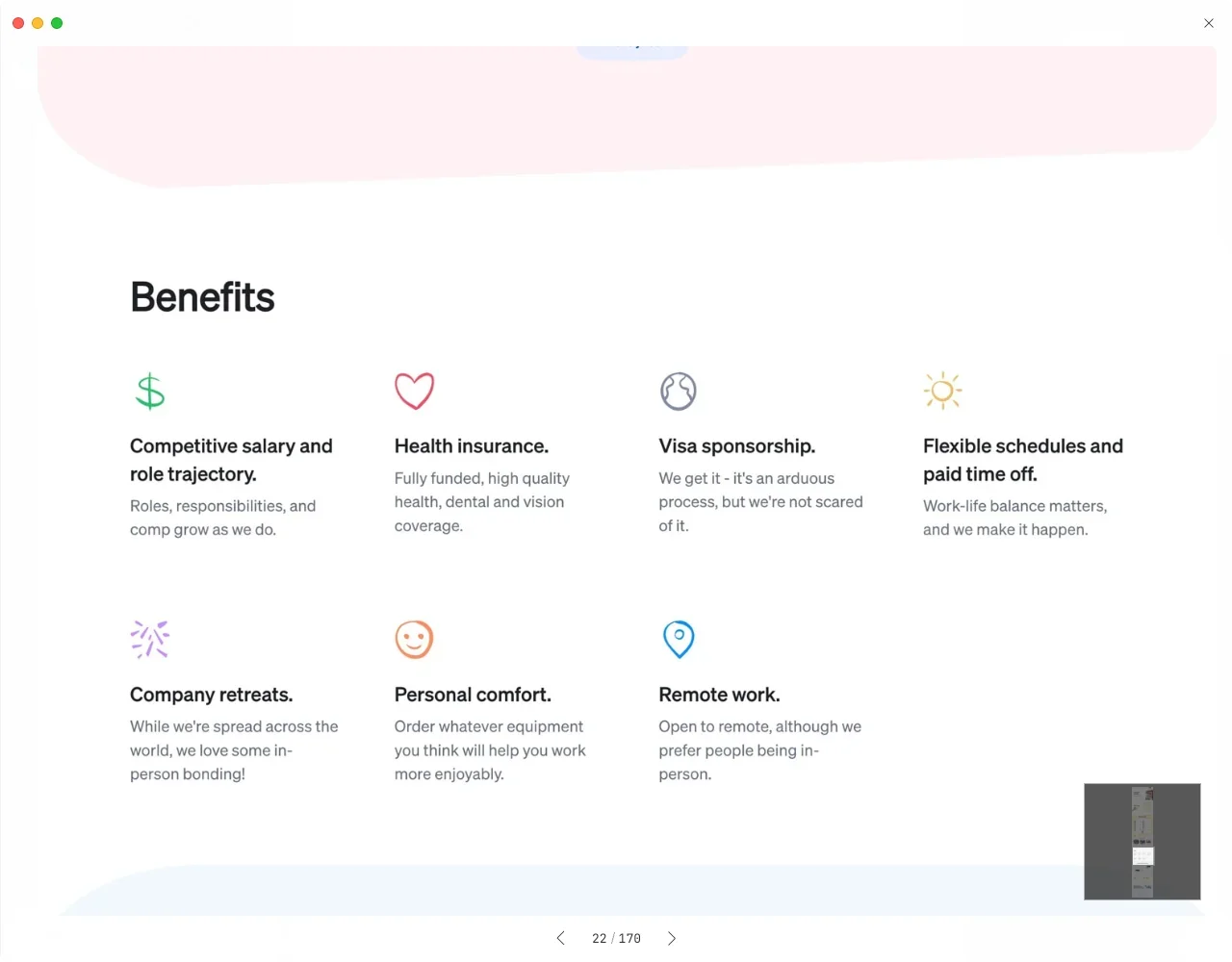
Master Four Design Details of Career Pages to Showcase a High-End Corporate Brand and Team 💪🏻
You might wonder, what does a career page for posting job vacancies have to do with marketing? High-end brands not only excel in their products but also perfect every detail that potential audiences might notice. In this digital age, it's hard to predict when and where your brand's content will be noticed. A well-detailed career page can also convey the company's care and sincerity to job seekers.
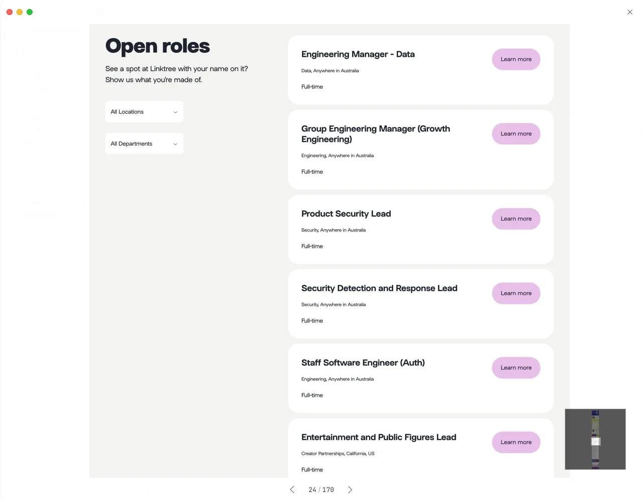
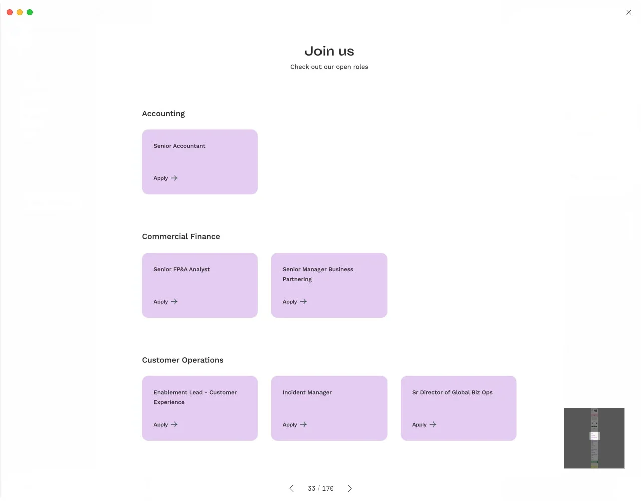
Clear Information and Structure:
Ensure that job information is presented clearly and structurally, including job titles, responsibilities, qualifications, and compensation, allowing job seekers to quickly understand the details of each position.Appropriate Use of White Space:
The use of white space in design is crucial. Proper white space helps establish clear relationships between elements, especially when job listings contain fragmented information. White space also enhances readability and overall aesthetics.Consistent Style and Format:
If multiple job vacancies are posted, ensure that all job information maintains a consistent style and format, including fonts, font sizes, and colors, to maintain overall visual unity.Highlight Key Information:
Use bold, italics, underlines, or colors to highlight important information, such as job titles and compensation, to attract job seekers' attention.
